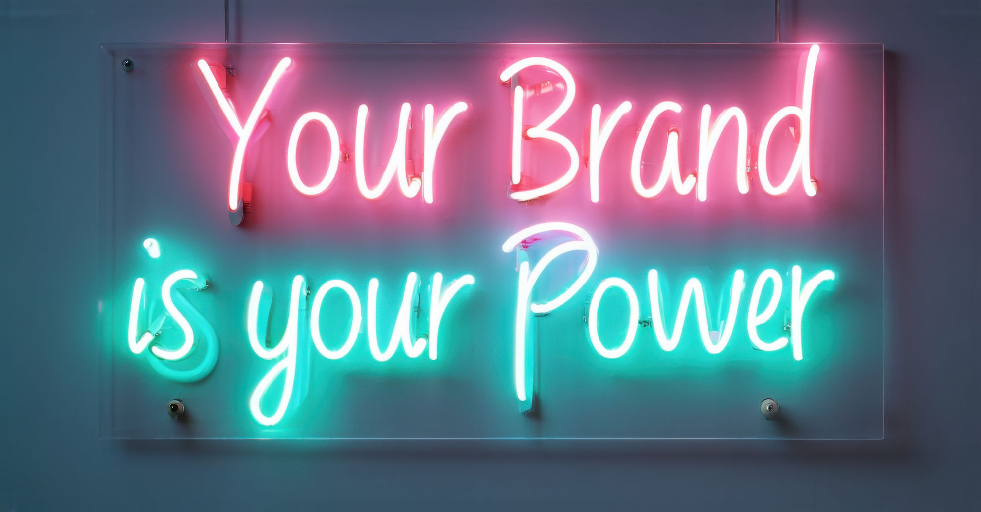
Typography In Branding Is More Than Just a Design Detail
Fonts do more than simply fill space; they carry weight, emotion, and meaning. In branding, typography shapes how a brand presents itself to the world. It influences tone, credibility, and recognition. Despite this, many businesses treat typography as a secondary consideration or an afterthought, rather than a strategic tool. It is important to consider typography as the language of your brand.
Every curve, serif, and stroke of your typeface conveys a message. Whether you select a clean, modern sans serif or a bold, vintage slab serif, your typography sets expectations for your audience, indicating who you are before they read a single word. When chosen with intention, it serves as a silent ambassador for your brand.
Why Typography in Branding Affects Perception
Typography acts as a visual extension of your brand’s voice. Just like tone of voice and logo design, your font choices should reflect your values and personality. For example, a bank that uses playful or childlike typography may create confusion or even distrust. Conversely, a toy company that adopts a rigid, corporate-looking font could come across as cold or unapproachable.
Effective typography enhances clarity and fosters connection. It makes content easier to read and elevates the user experience. Poor typography can distract, frustrate, or even undermine your message. Businesses that overlook the importance of typography in branding risk weakening the very identity they are trying to build.
Real-World Examples: When Typography Helps and Hurts
Consider high-end fashion brands like Chanel and Dior. Their elegant, timeless typography reinforces a sense of luxury. In contrast, the simplicity of Apple’s fonts underscores the brand’s commitment to minimalism and innovation. These brands do not just select fonts; they use typography to reinforce their identities and values. Often, brands even have fonts created to ensure they are original to their brand. Examples of this include the BBC and Google.
On the other hand, take Tropicana’s infamous rebranding in 2009. While the logo change gained attention, the shift in typography was equally disruptive. The clean, modern typeface introduced lost the warmth and familiarity of the original, leading to confusion among loyal customers. Subsequently, sales plummeted, and the brand reverted to its original look within weeks.
Another cautionary tale is the Gap’s short-lived 2010 logo update. The new font aimed to modernize the brand but ended up stripping years of identity and equity. The immediate backlash led Gap to pull the design within a week, demonstrating that the wrong typeface can alienate more than it attracts.
Typography Should Never Be an Afterthought
Typography influences mood, emotion, and trust. When businesses invest time in selecting typefaces that align with their brand personality, the result is greater cohesion and clarity. Carelessly chosen typography, treated merely as decoration, introduces friction into the brand experience.
At Clearbridge Branding Agency, we recognize the vital role typography plays in shaping brand perception. We collaborate with clients to identify fonts that not only look appealing but also convey the right message. Typography becomes a strategic asset, ensuring that every piece of content supports the broader brand identity. We also ensure that these typefaces work across all channels.
How to Choose the Right Typography for Your Brand
Choosing the appropriate typography begins with understanding your brand’s personality. Is your brand sophisticated and timeless, playful and bold, or minimal and modern? Your typeface should reflect that identity with clarity. For instance, a high-end boutique may benefit from an elegant serif font that conveys luxury and tradition, while a forward-thinking tech company might opt for a sleek sans-serif font to emphasize innovation and simplicity. The emotional tone expressed through typography should harmonize with your brand’s voice, message, and mission.
Readability should always be a priority, especially across digital platforms. Fonts must be adaptable to various sizes and contexts, from mobile screens to printed materials. Also, consider how your typography pairs with your logo and other design elements. Consistency is crucial for visual recognition. Your brand may use a primary typeface for headlines and a complementary one for body copy, but the objective remains the same: every letter should reinforce the story you want to convey. Choosing typography is not merely a creative decision—it is a strategic one that helps define how your brand is perceived, understood, and remembered.
Certain industries, such as banking and other regulated sectors, also face compliance requirements where typography plays a role in ensuring readability at small sizes to meet legal communication standards.
Let Your Typography Tell the Right Story
If your current typefaces feel outdated, lack consistency, or fail to represent your brand’s personality, it may be time for a refresh. At Clearbridge Branding Agency, we do more than help you choose the right fonts; we assist you in creating a visual identity that communicates with clarity and confidence across all platforms, from print to digital.
Whether you’re building a new brand from the ground up or refining an existing one, our team can guide you through the typography decisions that support your story, amplify your message, and elevate your presence. Contact us to schedule a branding consultation and discover how we can bring consistency, creativity, and strategy to every letter of your brand.
Work With ClearBridge Branding Agency
A full-service branding & marketing agency serving South Jersey, Philadelphia & Chicago. Explore our services:
Get a Free Consultation