Unboxing a Fresh,
New Brand Identity.
When Eastern Propak, a high-volume fruit packing and distribution company, came to Clearbridge Branding Agency, they weren’t just looking for a new logo—they needed a new brand identity as fresh, vibrant, and reliable as the produce they process daily.
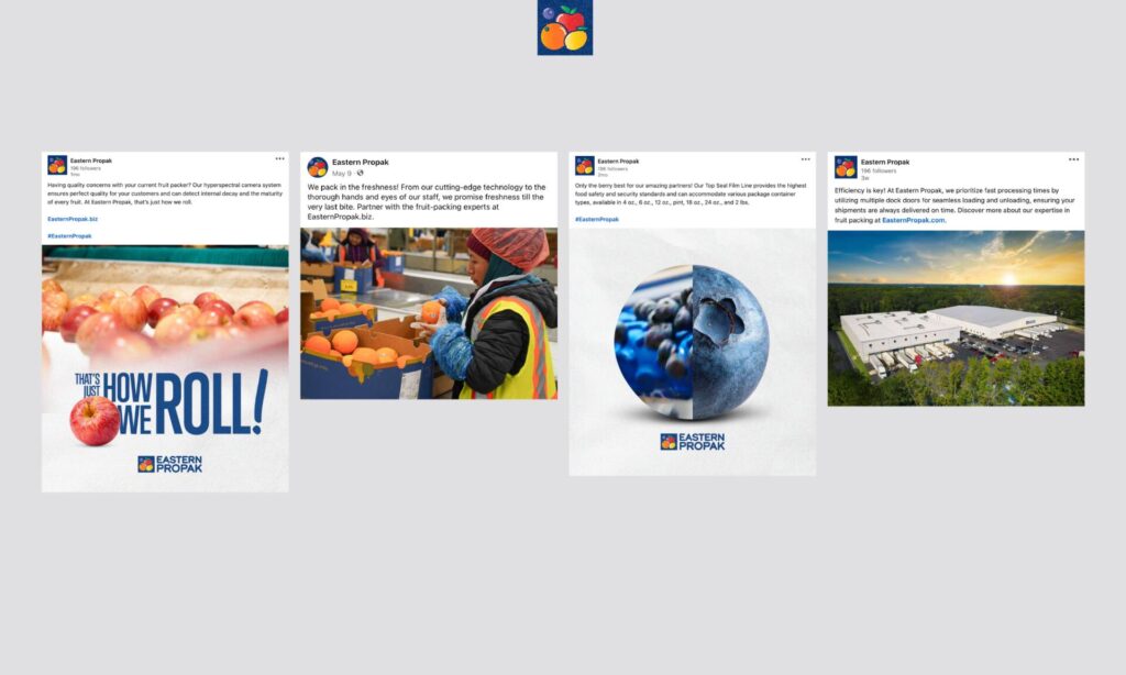
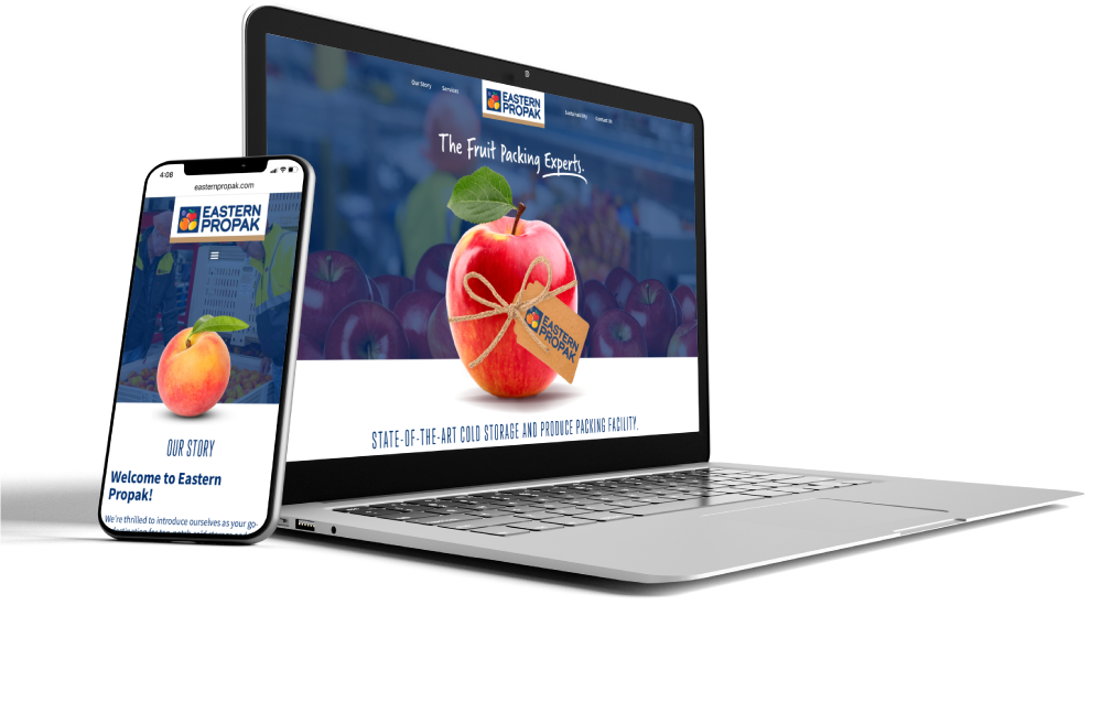
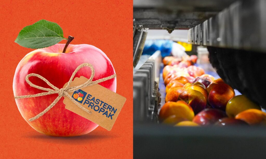
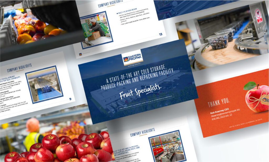
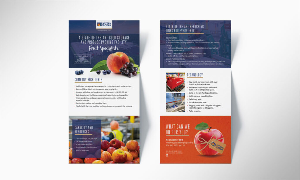
Inspired by classic fruit crate labels and modern logistics, we crafted a brand that feels both rooted in tradition and positioned for the future. From a brand new website to print materials and social content, the refreshed identity was applied across every touchpoint. Showcasing a cleaner, story-driven brand with vivid imagery; emphasizing the hands-on nature of produce handling, the scale of operations, and the personal care behind every packed piece of fruit.
We delivered a comprehensive rebrand that elevated Eastern Propak from a regional packing facility to a modern, shelf-ready brand built for growth and recognition.
When Eastern Propak, a high-volume fruit packing and distribution company, came to Clearbridge Branding Agency, they weren’t just looking for a new logo—they needed a new brand identity as fresh, vibrant, and reliable as the produce they process daily.
THE EASTERN PROPAK NEW BRANDING