A Legacy Reimagined.
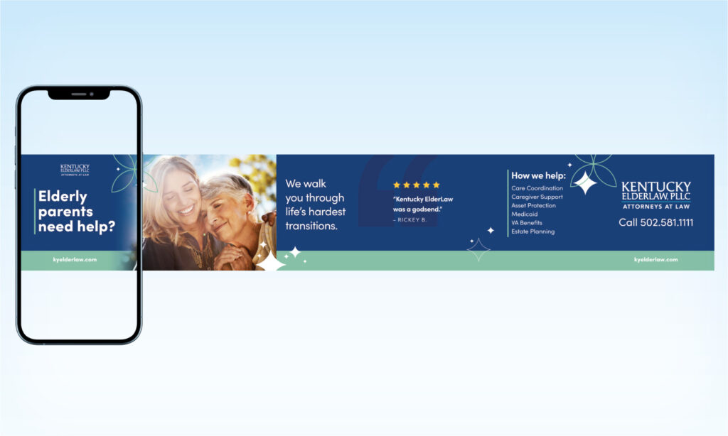
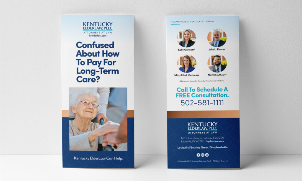
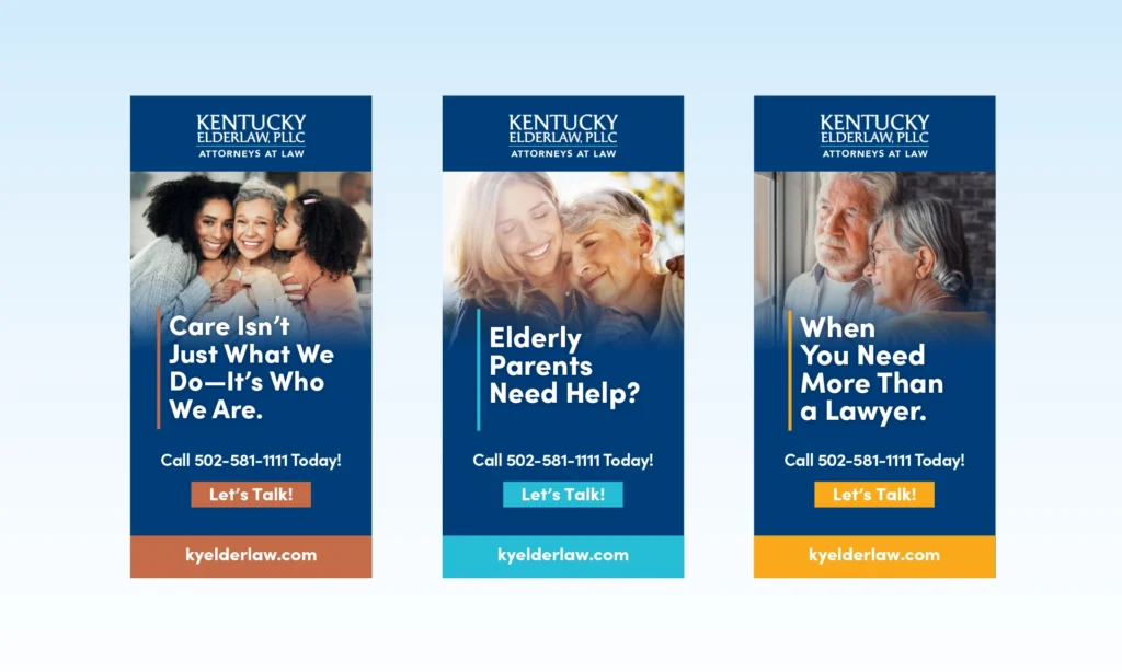
When your services are needed most, there’s no time for confusion. We rebranded Kentucky ElderLaw to speak directly to adult children and seniors alike—with messaging that’s clear, visuals that connect, and design that delivers peace of mind. We modernized the logo, simplified the typography, and introduced a calming, confident color palette. Visual hierarchy and real-life imagery brought empathy into every element.
What We Delivered


We didn’t just rebrand. We rethought how elder law shows up for the people who need it most—when they need it most. The result? A brand that’s ready to lead with empathy and act with authority.
THE KENTUCKY ELDERLAW NEW BRANDING
ORIGINAL LOGO

NEW REFRESHED LOGO
BLUE = LEADERSHIP + TRUST
PASTEL CYAN = PROTECTION + COMMUNICATIONS
